Shared Pantry
OVERVIEW
A mobile app to exchange food with your neighbors
The purpose of Shared Pantry is to create a method for neighbors to connect to exchange household items or food through a platform they can trust. I completed this group project as part of an interaction design course during the pandemic, when the typical grocery interaction was much less accessible. While we were all involved in all aspects, I took the lead on research and design for Exchange History, Reviews, and Thank You Notes.
Role
UX Designer & Researcher
Collaborators
Chulei Chen, Lizbeth Guerrero, Bonnie Jiang, & Shirley Wang
Platform
Mobile app
Timeline
4 months, 2020
THE PROBLEM
During the pandemic, users faced unprecedented challenges to gain access to fresh groceries.
A few of the many challenges when shopping for produce during the pandemic were fear of COVID-19 exposure and lack of transportation. This context presented a paradoxical dilemma among different households in one neighborhood. On the one hand, individuals often need to buy excessive produce to get it delivered. On the other hand, some families struggle to get certain essential products, as shopping is not as easy as before. There is no coherent and official solution to share the pantry and build a trusted network.
DESIGN CHALLENGE
How might we create a trusted community and provide an accessible way for neighbors to share the pantry?
SOLUTION
A safe, reliable method for neighbors to connect and exchange household items or foods
PROCESS
How did we get to the final solution?
In a team of 5 designers, our approach was to independently conduct user research and then come back together for discussion. We used Miro, Google Docs, Zoom, and Figma to remotely share knowledge and provide feedback. For wireframing and prototyping we each took the lead on a couple key functions and then combined our screens into one flow. When presenting our designs to the rest of the team we made sure to back up our design decisions with test results. Throughout the entire process we maintained close communication and were able to create a new means of acquiring essential items during a time of high stress, fear, and isolation.
01 Understanding the User
USER RESEARCH
To better understand our users’ goals and frustrations, we conducted 12 user interviews.
We developed a list of questions and interviewed users of different demographics, including young parents, college students, working adults, and the elderly. We detected patterns of user pain points across interviewees. Whether relying on delivery service or grocery shopping in person, users’ main frustration was not being able to find all of the items they needed, or that their family needed, in a single trip or order. This influenced our design moving forward because we focused on developing ideas about how our technology increases item availability and access.
COMPETITIVE ANALYSIS
We used our insights from user interviews to identify and select competitors that addressed some of these key areas.
In conducting our analysis, we raised a few questions regarding our audience and inclusivity as well as our desired functions and maintenance strategies for the app. One key takeaway is that we need to think about if our existing solutions are truly inclusive. We also learned we need to prioritize which functions to include in the app. Finally, we discovered the need to further discuss ideas on how we can foster and maintain trust to create a welcoming community.
PERSONAS & SCENARIOS
We created 4 personas based on our user interviews to represent different user groups.
We grouped interviewees together based on commonalities in goals, interests, motivations, pain points, and concerns. We selected Rosa as our primary persona - a single mother who lives with her parents. Rosa shared many challenges and frustrations with the other user groups; therefore, we focused our design on meeting her needs.
USER FLOWS
We created a visual mapping of the main screens and interactions, with arrows showing the various flows our users would take through our app.
Through diagramming, we gained a better understanding of how users could navigate between screens and identified areas that needed additional thought when prototyping. The user flow displays a user’s journey with the product from start to finish.
02 Starting the Design
PAPER PROTOTYPES
I designed and user tested an initial paper version of the following experiences: Search, Maps, Chat, Exchange, and Reviews.
We used the user flows as a guide to identify which screens and interactions were most important to sketch. We independently created paper prototypes and tested different parts of the experience to discover user pain points and opportunities.
Takeaways
One visual I found worked well during the usability test was the map feature, which shows the user’s location and highlights neighbors with the desired ingredients.
One pain point was users did not know the best way to describe their food items, which highlighted the importance of breaking up the text input into multiple sections and including buttons with various options for selection relevant to the user’s desired exchange experience.
DIGITAL WIREFRAMES
I used the test findings to iterate on four screens: Home, Make an Offer, Reviews, and Thank You Notes.
We used digital wireframing to continue exploring different ways to initiate an exchange: make a post, message, and make an offer. We also discussed the screens we found most essential for users and designed the navigation bar to meet these needs. Wireframing was important for us because it allowed us to quickly design and discuss the basic content layouts and narrow our focus in terms of the functionality.
03 Refining the Design
STYLE GUIDE
We each researched and found 2 sets of color palettes and font choices we thought would be a good fit for the app, and then voted for our top 2 of each to finalize our style guide.
It was essential for us to have a style guide to ensure consistency as we worked independently on different screen designs going forward.
DIGITAL PROTOTYPE (V1 & V2)
I used the style guide to create high-fidelity mockups for Exchange History, Reviews, and Thank You Notes.
We each prototyped a couple key functions, then combined all the designs into one clickable prototype to test with users.
USABILITY STUDY
We created a test plan with 10 tasks to gain feedback on key functions in our app.
We had each of our users complete 4 tasks, which allowed us to test each feature a couple of times. After we conducted testing independently, we met as a group to find patterns in pain points and discuss opportunities to improve our prototype.
Study Type
Unmoderated usability study
Device Type
Mobile
Location
United States, remote
Participants
10 participants
MOCKUPS
I revised the designs based on team feedback and usability test findings.
Exchange History
The goal of the history screen is to provide users with key details from their previous exchanges and allow them to write a review and/or thank you note. One key change after testing was separating the history from my posts, and instead having users access this screen from the profile tab.
Reviews
One main change based on our test findings was removing the smaller photos and creating a horizontal scroll for the food photos at the top of the screen. We also discussed as a team and decided it would be beneficial to separate reviews on homemade items from other exchanges.
Thank You Notes
We discussed as a design team how we could collapse the editing functionality into one button that would horizontally expand to allow note customization, such as color change. In testing we received positive feedback on the ability to copy and paste from previous notes; therefore, we continued to develop this idea.
KEY MOCKUPS
We made some key modifications to the mobile prototype in response to our findings from the second round of usability testing.
One main pain point we discovered was lack of clarity in navigation. We designed a plus icon at the center of the lower navigation bar to make a simpler and more convenient way for users to make a post. We wanted the navigation bar to contain the most essential components for easy daily access, and through testing we were able to develop a better understanding of when and how users would utilize Shared Pantry.
HIGH-FIDELITY PROTOTYPE
The mobile prototype captures a user’s experience from the beginning to end of an exchange.
01 Search for Items & View Post Details
Users can start by selecting whether they would like to view nearby food options or services. Users can also navigate to the search tab to type in a specific item and add filters to refine their search. Users scroll through the matching posts until they find one they like, and then have the option to read about the item in more detail, react to the post and/or leave a comment.
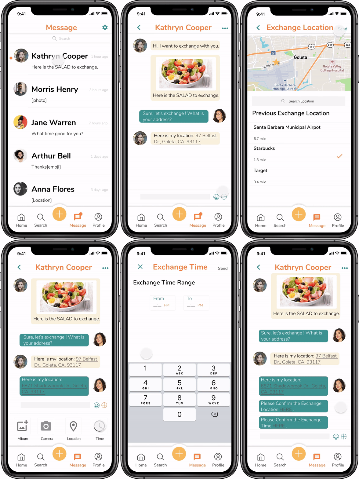
02 Message & Set Exchange Location
Users can initiate an exchange through the message tab. Users do not pay for the items, but rather exchange one item for another. Shared Pantry is not about profit; it is about neighbors supporting one another through difficult times, therefore, we want to encourage users to communicate directly with one another. Once in the messenger function, users can set an exchange location and time. Users can choose a public, shared location like a local Starbucks and build a connection through the exchange.
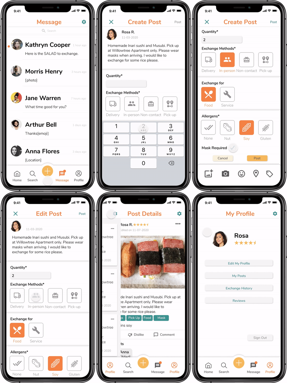
03 Create & Edit Posts
If users have an item they want to exchange they can make a post by selecting the plus icon. They can add a description, quantity, exchange method, type, allergens and other details. Users can adjust these items based on their comfort level; for example, mask required for exchange. Once they post, they have the ability to edit any details and are notified if other users are interested in exchanging.
04 Write Reviews & Thank You Notes
Users have the ability to write custom thank you notes to express their gratitude following an exchange. The purpose of this feature is to help build lasting, positive connections. Users can also write and read reviews which helps to build trust within the network and ensure the sources are reliable.
FINAL DESIGN
The video provides a comprehensive walkthrough of a user’s experience in the Shared Pantry app.
04 Going Forward
IMPACT
We designed a socially impactful app to help individuals connect to a larger community network and share necessities in an unprecedented time of isolation.
The pandemic introduced many novel challenges to the traditional grocery shopping experience, and through testing we received a lot of positive feedback from our users around the mission of Shared Pantry. We designed an app to solve a meaningful problem. The part of the app I had a large impact on and am very proud of is the thank you note feature. I introduced this idea and led the research and design efforts to provide a personalized way to create and foster a positive community.
WHAT I LEARNED
I learned the importance of using a style guide to establish consistency across designs and how to effectively collaborate with multiple designers across 3 different time zones.
One of the challenges of working remotely was ensuring cohesiveness across the app. We divided the work so each of us mocked up a couple of screens, and then we had meetings to review and critique the designs. We also independently conducted usability testing, so it was important to meet and share findings so we could identify commonalities among user pain points. As the designs became more refined, I learned the importance of establishing consistency in color and typography as well as in components such as buttons and navigation.


